Optimizing Aureola: Conclusion

In the previous articles in this series, I showed you how I optimized my blog. Not only was I able to reduce the size of the website, but also the response time has improved significantly. Time to take a look at the result and draw a conclusion.
Initial state
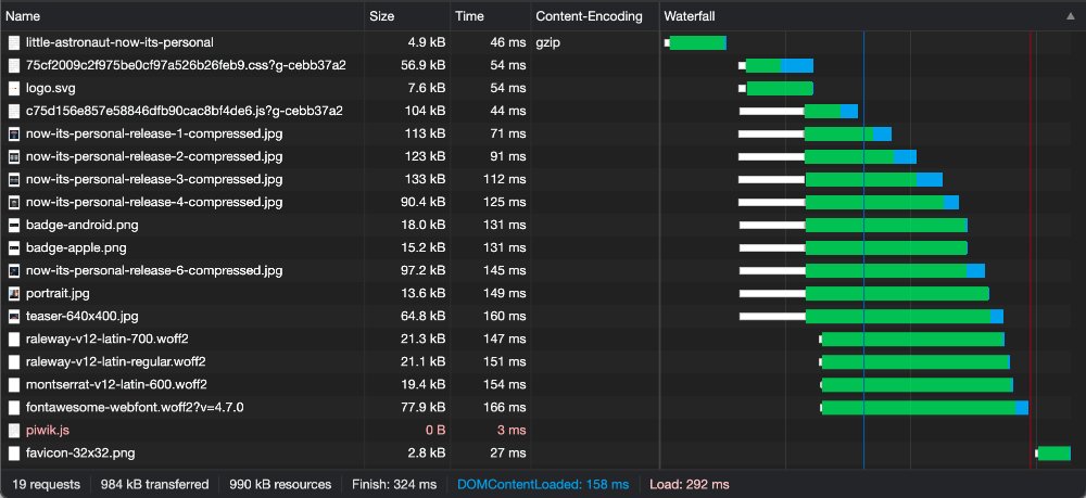
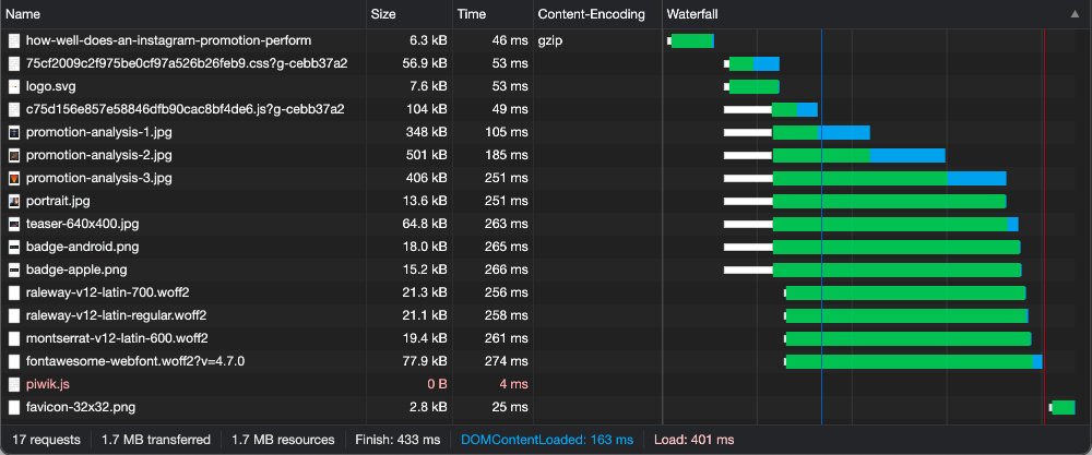
I started the optimization by picking out two articles. Little Astronaut - Now It's Personal (1) and How well does an Instagram promotion perform? (2) were to be examples for the performance of the respective website. Article 1 had a response time of 324 ms at the beginning and a download size of 984 kb with 19 requests. With the second article I measured a download size of sporty 1.7 MB and a response time of 433 ms with only 17 requests. Through various optimizations I was able to improve these parameters significantly.
Optimization
In several articles I then showed step by step how to improve the initial state. The different optimizations had more or less significant effects.
Using gzip Compression
Impact: low
Initially, I enabled gzip compression under Nginx. The effect was modest. This is of course mainly due to the fact that I don't include noticeably large scripts on this website. So there is not really a lot of potential either. From initial 984 kb and 1,7 MB the download size was reduced to 866 kb and 1,6 MB. The response time remains almost unchanged or increases slightly from 324 ms and 433 ms to 359 ms and 459 ms. Slightly increasing response times are not surprising when using compression. Unless a static cache is used for the compressed files, the respective file must of course always be processed again before delivery. This costs time, although in this case it is negligible.
Deliver JPG & PNG as WEBP
Impact: high
As the next optimization I decided to deliver JPG & PNG as WEBP. Webp has much better compression compared to the formats mentioned before and therefore smaller file sizes. Many images are used on the selected pages. Accordingly, a significant effect should be apparent here. And so it is. From 866 kb and 1.6 MB the download size is reduced to 495 kb and 375 kb. The response times are reduced from 359 ms and 459 ms to 279 ms and 265 ms.
Using an Optimized Iconfont
Impact: medium
Another resource that could be optimized was the icon font in use. Instead of using Font Awesome with 700 icons and a size of 77.9 kb, I decided to try a font from Icomoon. This font is only 4.1 kb in size and therefore much smaller than the previously used one. The exchange of the icons in the markup was of course quite annoying busy work.
Preloading, Caching and Other Things
Impact: low
Finally, I have made various smaller optimizations. This includes a better configuration of the browser cache. In addition, I have integrated the logo directly into the page and thus saved a request. Small things also make crap.
Results
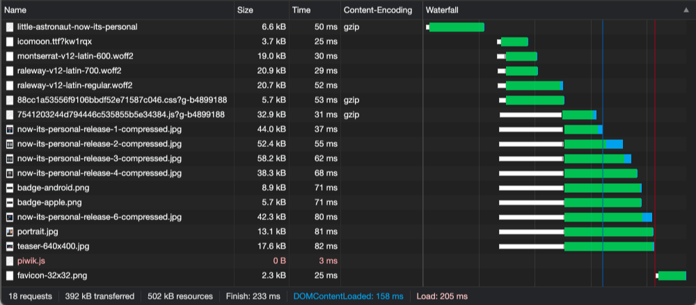
While the article Little Astronaut - Now It's Personal previously loaded in 324ms and covered 984kb, it now loads in 233ms and covers only 392kb. So the response time was reduced by 28%, and the size by a whole 60%.
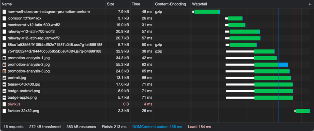
The article How well does an Instagram promotion perform? was initially loaded in 433ms and the download size was 1.7mb. Now it loads in 213ms and is only 272kb. Here, the time is reduced by almost 50% and the download size drops by more than 80%.
The number of requests has not reduced significantly and should therefore be left out here.
Conclusion
The improvement is impressive. However, it must be said that not all optimizations have made much difference. Depending on which resources are integrated on a page, different optimizations can make varying amounts of sense. Here you must also always clearly evaluate whether the effort is worth it.
For me, developer hours are of course ultimately free. If I spend a few hours on an optimization that may only improve the performance by a few kilobytes or milliseconds, that's no big deal. In a professional context, such optimizations should be done with a sense of proportion. So consider carefully which optimization is necessary. Always keep an eye on the costs and benefits.
Outlook
I myself do not want to stop at this point, of course. Shouldn't the images be delivered better in the appropriate sizes and best responsively? Does it really have to be a separate icon font or can't all icons just be included directly? There are still some things that could be improved. At the moment I can't say when exactly I will take care of it. But it will happen for sure. Until then. Farewell.
There are no comments yet.


